A guy with a scarf

Interactive
Sport Experiences

Sport is data, and data can be beautiful. These are independent fan projects, built with passion from official feeds and a lot of late evenings — a World Cup you can walk through match by match, a tennis season told one player at a time, a Formula 1 year read lap by lap.

Nine experiences live Best in landscape on laptop & iPad — great on a phone too By Carlo De Marchis

Looking for a dataviz creative director in sport and media? This is the work — let’s talk about doing it for you.

Contact me on LinkedIn
A guy with a scarf Interactive Sport Experiences Contact me on LinkedInLinkedIn
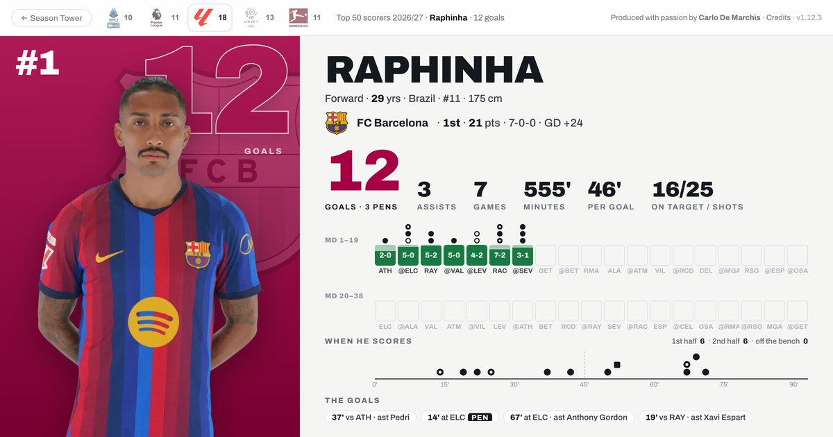
The Top 50 scorers film: Raphinha's card, number one with 12 goals for Barcelona — his matchdays, the minute of every goal, and who set each one up.

New Football · Top 5 leagues

The Top 50 scorers across Europe

One film for the leading scorers of the Premier League, LaLiga, Serie A, Bundesliga and Ligue 1 — everyone tied at the cut included. Each card shows every goal match by match: the minute he scored, who set it up, penalties and goals off the bench. Updated every night.

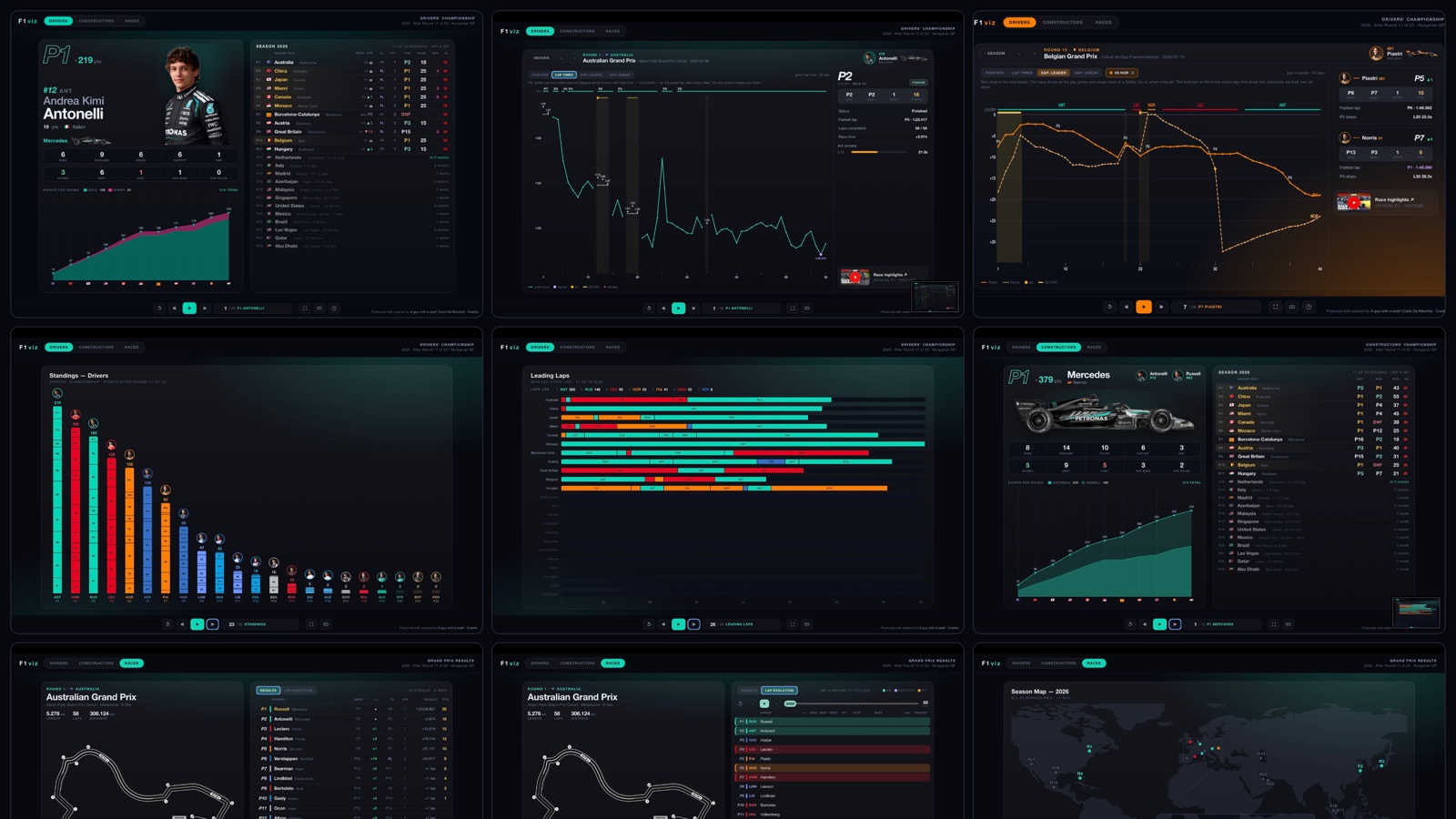
Nine screens from F1viz: Antonelli's driver card, a lap-time pace chart, a gap-to-leader trace, the drivers' standings, the leading-laps chart, the Mercedes constructor card, the Australian Grand Prix results, the season map and the lap-evolution timing tower.

Formula 1 · F1viz

A season read lap by lap

The 2026 championship in three films — Drivers, Constructors and Races. Every Grand Prix opens into a deep dive: the position trace with its pit windows and safety cars, lap-time pace, gap to the leader, gap to the car ahead — and a self-playing timing tower where all twenty-two cars re-sort themselves on every lap.
  • Three films
  • Lap evolution
  • Race deep-dives
  • Season map
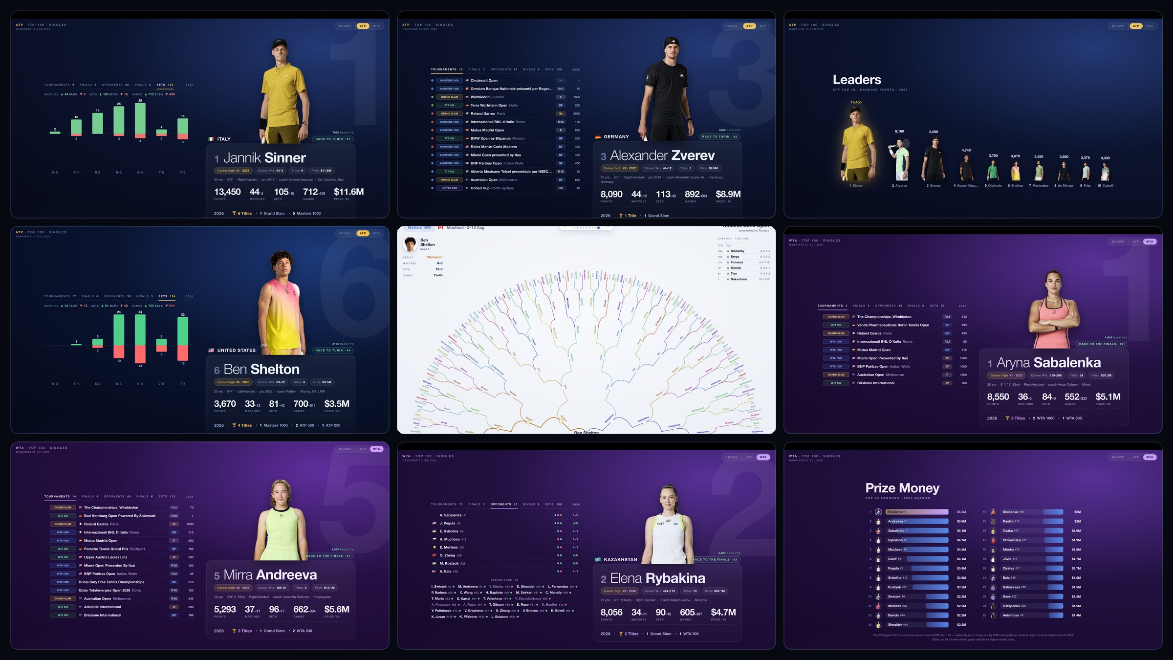
Nine screens from the tennis experience: ATP cards for Sinner, Zverev and Shelton, the ATP leaders chart, a tournament draw drawn as a fan, and WTA cards for Sabalenka, Andreeva and Rybakina alongside the WTA prize-money board.

Tennis · ATP & WTA

The season, one player at a time

Two hundred cards in ranking order — the ATP Top 100 and the WTA Top 100, each on their own full-screen page. Every tournament played, every set score, head-to-heads against the rivals who actually mattered, and the money charts at the end. Then step across to the draws, where a finished tournament unfolds as a fan of matches.

  • ATP Top 100
  • WTA Top 100
  • Tournament draws
  • Prize money
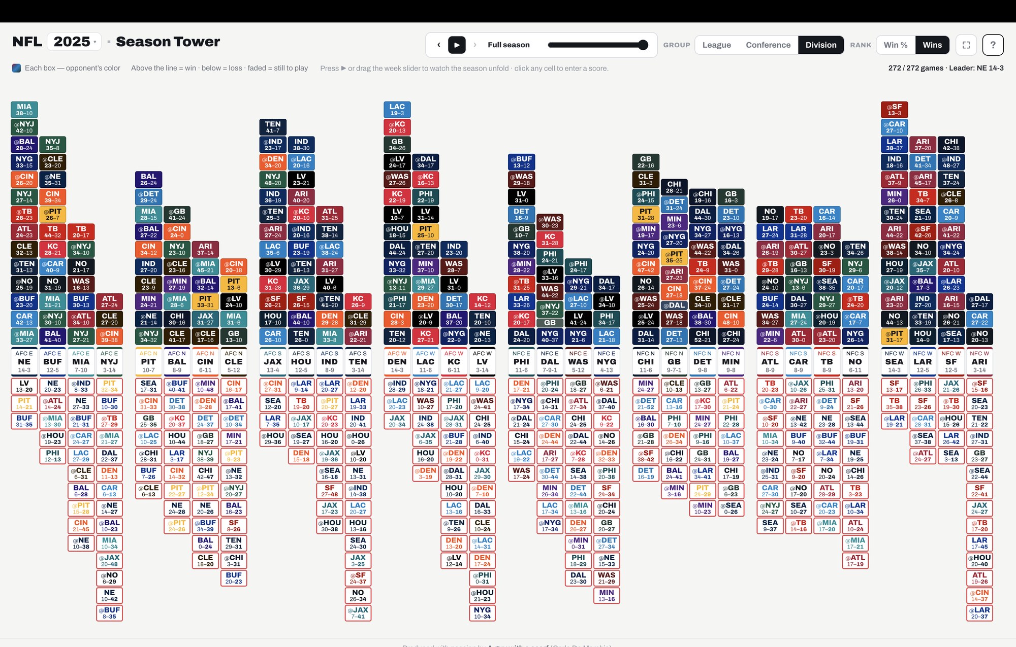
The NFL Season Tower showing a completed season: all thirty-two teams grouped by division, each a tower of games with wins stacked above the baseline and losses hanging below it.

NFL · Season Tower

Wins up, losses down

All thirty-two teams on one shared baseline. Every win stacks the tower upwards, every defeat hangs below the line, and the games still to come drop from the ceiling — so a season becomes a shape rather than a table. Drag through the weeks and watch the divisions re-order themselves as the year plays out.

  • 32 teams
  • Week-by-week replay
  • Three seasons
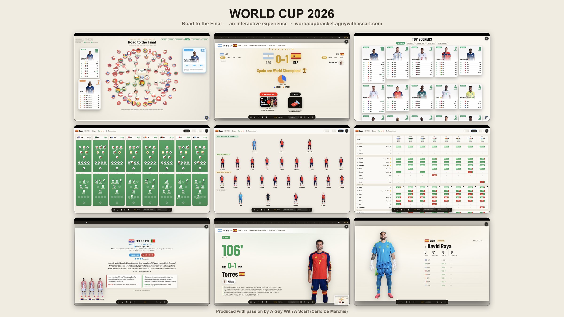
Nine screens from the World Cup 2026 experience: the radial knockout bracket, the final between Argentina and Spain, the top-scorers board, Spain's squad rotation pitches and matrix, a controversy fact-check card, a goal beat from the film, and a goalkeeper card.

World Cup 2026

Road to the Final

The entire knockout tournament as a single radial bracket — every nation, every score, every penalty shoot-out in one picture. Tap a match for goals, cards, line-ups and possession, or press ▶ Film and let the tournament replay itself beat by beat. You can also follow one nation from their first group game to the final whistle, and dig into the Controversy Tracker for the calls that decided it.

  • Radial bracket
  • Story film
  • Live FIFA data
  • Controversy tracker
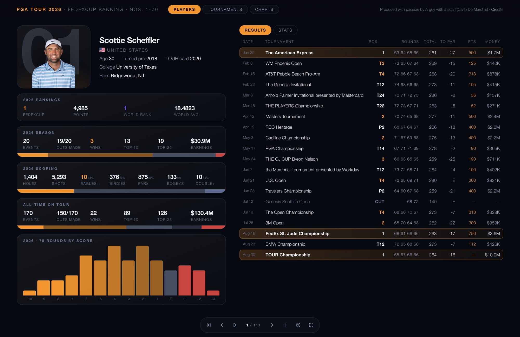
A PGA TOUR season card for Scottie Scheffler: FedExCup rank, season and all-time statistics, a histogram of his rounds by score, and every tournament he played.

Golf · PGA TOUR

Every round, hole by hole

One card for each player in the FedExCup top seventy, and one for each of the season's thirty-seven tournaments. Every start is there — finish, rounds, earnings, the spread of a whole year's scoring — and under each tournament sits the entire field's scorecard, hole by hole, drawn straight into the heat map instead of hidden behind a click.

  • FedExCup top 70
  • 37 tournaments
  • Whole-field scorecards
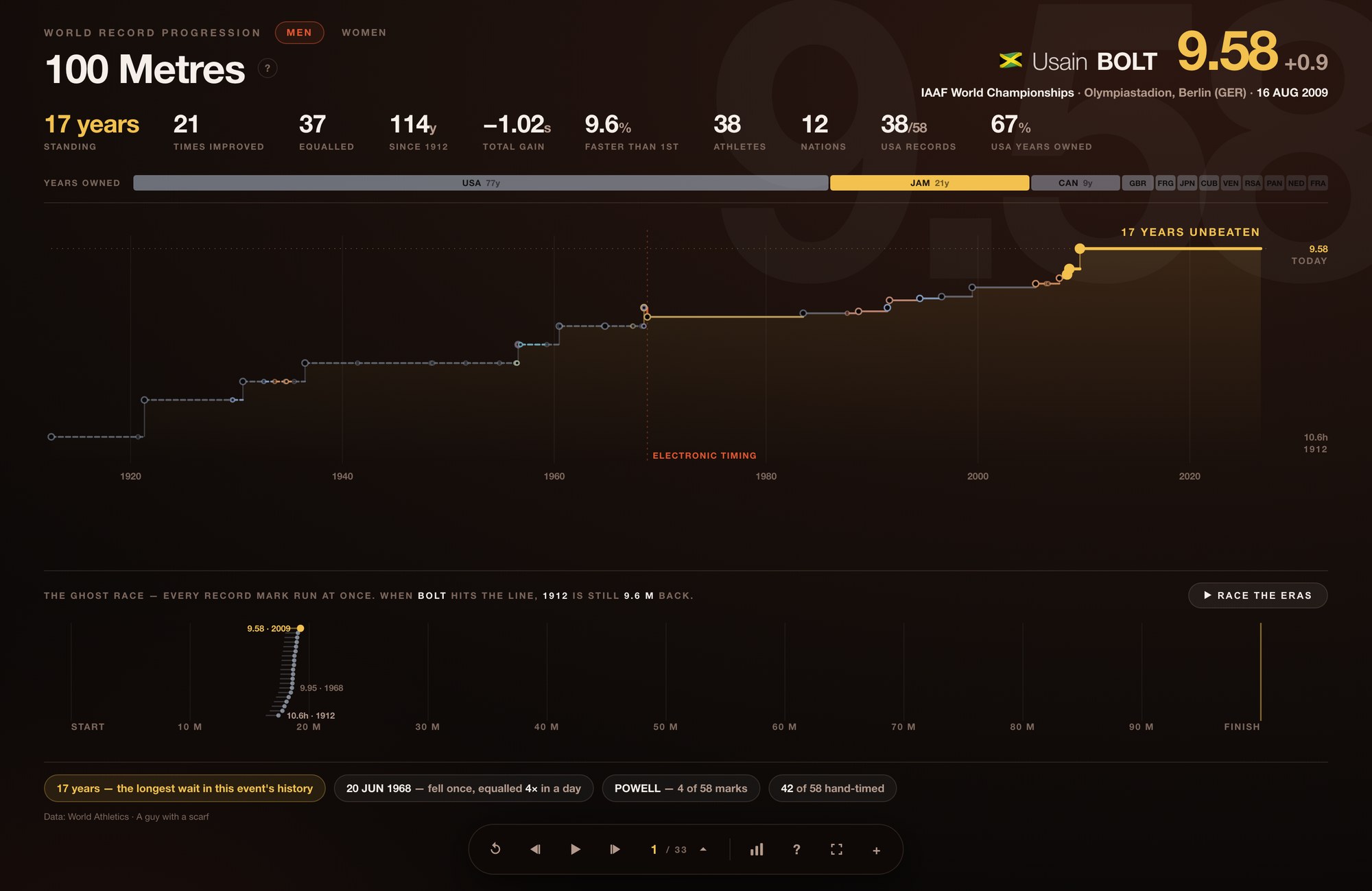
The men's 100 metres world record card: a staircase of every record mark from 1912 to Usain Bolt's 9.58, and the ghost race running all of them at once.

Athletics · World records

A century, one staircase

Each discipline drawn as a staircase of marks falling across a hundred years — who held the record, for how long, and by how little it moved each time. Then the ghost race runs every record holder at once: when Bolt crosses the line in the 100m, the 1912 mark is still 9.6 metres back. Two companion films sit beside it — the all-time top fifty in every event, counting each performance rather than one per athlete, so a sprinter who ran it six times appears six times; and the Ultimate Championship in Budapest, event by event, start lists as they are published and results as they land.

  • Men & women
  • The ghost race
  • All-time top 50
  • Ultimate Championship
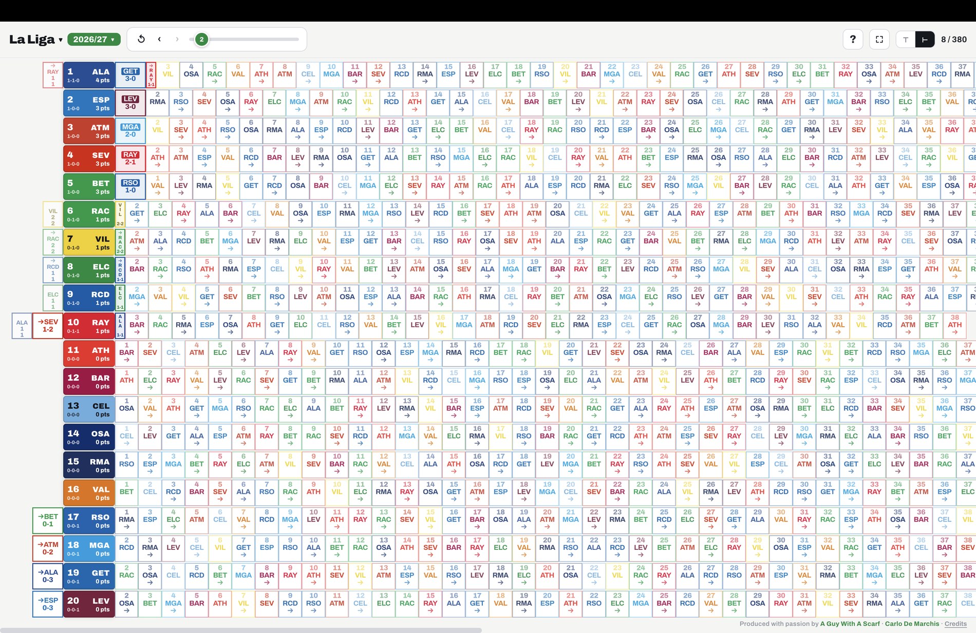
La Liga in the Season Tower: twenty clubs as rows, points kept extending to the right of each club and points dropped to the left.

Football · Europe's top five

Football Interactive

A team starts the season already owning every point it can win — thirty-eight games, three apiece. From there you don't earn points, you try not to drop them: a defeat costs three, and a draw still quietly costs two. So each club becomes a tower, what it kept stacking up and what it let slip hanging below. Two teams level on points stop looking alike. Serie A, the Premier League, La Liga, Ligue 1 and the Bundesliga, updated daily. The idea is my son Miles', aged eleven.

  • Five leagues
  • Towers & rows
  • Updated daily

In the workshop

Built, being polished, or still on the bench.

There is more on the bench — a swipeable World Cup for phones, and whatever the next season makes me curious about.

Other sports tech work

Not data visualisation — an app I run, a course I teach, and the research I publish.

A guy with a scarf

The newsletter: new experiences as they land, how they get built, and what the numbers turn out to say once you draw them properly. Follow along on either.